
How to Take Professional Fitness Equipment Photos
Understanding goals, audiences, and meticulous shoot planning for fitness equipment
A professional fitness equipment shoot begins long before the camera clicks. Success hinges on clarity of purpose, understanding where the images will live, and building a practical plan that aligns with brand identity and audience expectations. Start by defining the primary use of the photography: e-commerce product pages, social media, lookbooks, or advertising campaigns. Each channel has distinct requirements for framing, resolution, and styling. A well-defined goal sets the tone for the entire process, from lighting choices to color grading and retouching standards.
Work backward from measurable outcomes. Typical ecommerce metrics include faster time-to-purchase, higher add-to-cart rates, and stronger engagement with lifestyle imagery. While the impact varies by category, fitness equipment often benefits from multiple angles, clear scale references, and demonstrations of key features (adjustable weights, foldable frames, quick-release pins). Establish success criteria such as:
- Minimum number of product angles (e.g., 6–8 angles for standalone product shots)
- Ratio of lifestyle to product-only images (e.g., 70/30)
- Hard-crop and macro shots for distinctive details (pads, texture, grip)
- Color accuracy targets (Delta E < 2 in sRGB space)
Next, create a master shot list and a simple storyboard. The shot list ensures coverage of every feature (material finishes, texture, logos, packaging) and usage scenarios (home gym, garage gym, commercial setting). A storyboard, even a rough one, helps teammates align on composition and sequence, reducing post-production rework. Include:
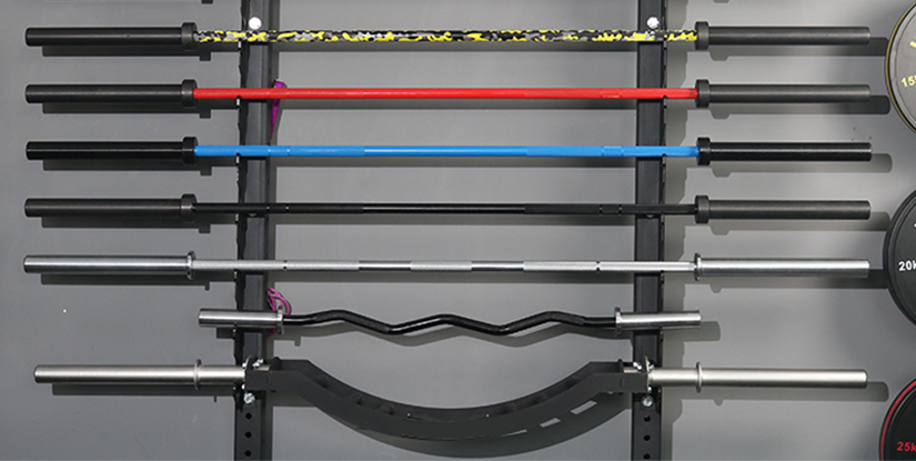
- Product-only angles: front, back, side, top-down, and isometric
- Detail close-ups: grip texture, adjustment mechanisms, serial plate
- Lifestyle frames: person using the equipment, scale references, ambient environment
- Specifications and packaging: included accessories, warranty card, weights
Practical tip: plan a two-hour “golden hour” window for the core shoot, with a 30-minute buffer for setup, and an additional 60 minutes for styling tweaks. Prepare a simple shot schedule and a color-managed workflow to ensure consistency across days and locations. A well-executed plan minimizes retakes and accelerates time-to-publish.
Defining outcomes and success metrics for fitness gear imagery
Quantify success with specific, trackable indicators. Beyond vanity metrics, tie photography outcomes to business goals. Consider these metrics:
- Conversion lift on product pages after updating photography (e.g., 8–20% uplift in click-throughs and add-to-cart rates)
- Engagement quality on social channels (average time on image, saves, shares)
- Consistency scores across SKUs (a uniform look boosts brand recognition by up to 15%)
- Turnaround time and production cost per SKU
Keep a concise brief for every project: product category, target audience, required formats, color targets, and delivery timelines. Use a shared checklist and a central mood board to keep teams aligned. This communication backbone reduces back-and-forth and ensures final assets meet both brand and platform specifications.
Building a practical shot list and storyboard examples
Consider a practical example for a modular dumbbell set. Your shot list might include:
- 6 product angles: front, back, left, right, top, angled isometric
- 3 detail shots: grip texture, dial, weight plates
- 2 lifestyle frames: user gripping the set during a warm-up, stacked in a compact home gym
- 1 packaging shot and 1 accessories shot (storage rack or case)
Storyboard snippets can be sketched, or created as a simple shot sheet with target crop sizes (e.g., 1:1 for social, 4:5 for site banners, 16:9 for banners). For multi-SKU shoots, maintain a standard frame template and a consistent baseline exposure so that the entire catalog feels cohesive when viewed together.
Lighting, camera settings, and backdrop strategies for fitness gear
Lighting is the backbone of professional fitness photography. The goal is crisp detail, faithful color, and a controlled sense of depth that makes metal, plastic, and silicone textures pop. Start with a reliable three-point lighting setup and adapt based on the product’s shape and use case. A common approach involves a key light with a soft modifier, a fill light to reduce shadows, and a backlight to separate the subject from the background. For sport or heavy equipment, you may also incorporate a rim light to emphasize form and durability.
When selecting camera settings, choose lenses that maximize detail and minimize distortion. A 50mm prime or a 85–100mm macro is ideal for product shots, while a 24–70mm zoom offers flexibility for lifestyle frames. Shoot in RAW for maximum dynamic range and post-processing latitude. Typical starting points:
- Shutter speed: 1/125–1/200 second for handheld or tripod-based shoots
- Aperture: f/8–f/11 for sharp products with clean depth of field
- ISO: 100–400 to maintain image quality
- White balance: consistent daylight (D65) or stabilized color temperature around 5200–5600K
Backdrop choices subtly influence perceived product quality. A clean, neutral backdrop (seamless white or light gray) is ideal for catalog-style shots, while a restrained lifestyle backdrop (gym environment, wood floor, or matte textured surface) adds context without overwhelming the product. If you use color backdrops, ensure they complement the product finish and branding. Always test a few color temperatures and backdrop combinations to avoid color cast on metal finishes or reflective surfaces.
Lighting techniques and equipment for consistent, studio-grade results
Implement a standard lighting kit that can scale across SKUs. A typical starter kit includes large softboxes or octa banks, a couple of LED panels for fill, and a small rim or hair light. Consider these practical guidelines:
- Light with a large modifier placed at 45 degrees to the product for even, flattering shadows
- Use a white or silver reflector on the opposite side to soften shadows without flattening texture
- Keep color temperature consistent across all lights to avoid color shifts in chrome or anodized finishes
- Use a dedicated light-diffusion panel for glossy surfaces to control hotspots
Practical setup steps:
- Mount the product on a stable platform with a clean surface
- Position key light at approximately 45 degrees angle and slightly above the product
- Adjust fill light for natural-looking shadows without washing out texture
- Fine-tune backlight to create a crisp edge and separate from the background
Styling, color management, and product presentation for fitness gear
Styling elevates a product shot from a catalog image to a storytelling asset. For fitness equipment, styling should communicate usage, durability, and practical value without distracting from the product’s form. Start with a calm color palette that aligns with brand guidelines. Ensure the product finish is accurately represented: metallics should read true, plastics should appear solid, and textiles should look tactile. Color management is essential. Calibrate your monitors, embed ICC profiles, and soft-proof color for print or digital distribution. A consistent color workflow reduces post-production retries and ensures the catalog looks cohesive across platforms.
Detailed styling guidelines include:
- Use neutral props sparingly to frame scale (e.g., a standard yoga mat, a water bottle), ensuring they don’t overpower the product
- Show functional features in context: weighted plates clicked into place, adjustable handlebars, fold mechanisms
- Highlight texture: knurling on bars, grip material, rubber feet
- Maintain brand typography or logo visibility on packaging and accessories
Color management tips:
- Calibrate displays and cameras to a common target (target D65 or similar)
- Use a gray card to set custom white balance in studio conditions
- Soft-proof for digital channels to ensure consistent print-like color on web and mobile
Case study example: a mid-range kettlebell line used a consistent 4-camera setup with a neutral backdrop and lifestyle frame. The outcome was a 12% uplift in add-to-cart rates after harmonizing the color and texture across all SKUs, with faster recognition of finish quality on product pages.
Backgrounds, props, and environment that enhance credibility
Background choices matter. A pure white backdrop provides clean product separation and is ideal for technical specs. A subtle textured backdrop or a controlled lifestyle scene can build credibility for gym owners and home gym enthusiasts. When selecting props, prioritize function over clutter. Props should demonstrate size, usage, or ecosystem (e.g., storage rack, weight plates, or a bench) without stealing attention from the product.
Practical workflow for background management:
- Prepare multiple background panels with consistent lighting to avoid color drift
- Maintain a clean, dust-free shooting environment and inspect each frame for specs visibility
- Use masking or clipping paths to separate subject cleanly for ecommerce catalogs
Post-production workflow, color accuracy, and final delivery to channels
A disciplined post-production process ensures consistent quality, quick turnarounds, and compliance with platform requirements. A robust workflow typically includes data management, RAW processing, retouching, color grading, and export packaging tailored to each channel. Start with a non-destructive workflow: keep RAW files, create layered TIFFs or high-quality JPEGs, and maintain a shared naming convention.
Key steps in a practical workflow:
- Organize: cull out unusable frames, label keepers by angle and variant
- RAW processing: adjust exposure, white balance, shadows, and highlights; correct lens distortions
- Retouching: preserve texture, remove specks, balance chrome highlights, ensure even skin-tones for lifestyle shots
- Color grading: apply a brand-consistent look; maintain natural look for product finishes
- Exports: deliver web-optimized JPEGs (for most channels) and print-ready TIFFs if required; provide alternate crops and sizes per platform
Quality control checks before delivery should include: color accuracy verification, shadow detail, highlight clipping, and crop consistency across assets. A well-documented deliverable spec—file names, resolutions, color profiles, and URLs—reduces back-and-forth with marketing teams and retailers.
Automation, workflows, and practical tips for speed
Automation can dramatically reduce post-production time. Examples include batch renaming, applying a standardized color grade to all product images, and using presets for export settings. Consider a shared pre-set workflow for all SKUs to maintain a uniform look and expedite publishing. Practical tips include:
- Use camera tethering to capture directly into a catalog workflow; name files with SKU, angle, and shot type
- Create export presets for different channels (website, social, email) with appropriate resolutions and compression
- Maintain a centralized asset library with version control to track edits and re-exports
Case study takeaway: a publisher standardized lighting presets and export pipelines for a line of resistance bands, reducing post-processing time per SKU from 90 minutes to 40 minutes and enabling daily publish cycles.
Practical workflows, case studies, and best practices for consistent results
Real-world shoots require flexibility and discipline. Develop a repeatable framework that keeps creativity alive while ensuring consistency. A practical workflow might include the following phases: pre-production briefing, on-set capture, immediate on-site review, comprehensive post-production, and final delivery. During pre-production, assemble a core team (photographer, stylist, art director, and production assistant) and establish a shared mood board with color palettes, typography guidelines, and usage scenarios.
In-session practices that drive efficiency:
- Assign a shot supervisor to track which angles have been completed and what remains
- Use a white balance card and light meter as you shoot to minimize deviations
- Capture test frames at the start of each lighting change and lock settings before moving to the next product
- Keep a digital shot log for quick reference during retouching
Case studies emphasize how planning translates into faster time-to-publish. For instance, a gym equipment brand implemented a modular set of lighting and camera presets, enabling multi-SKU shoots in a single day with consistent color and texture across products. The result was a 25% reduction in production days and a 15% boost in catalog coherence across channels.
Frequently asked questions
- Q1: What gear do I need for professional fitness equipment photography?
Answer: A reliable DSLR or mirrorless body, a 50mm or 85mm macro lens, a sturdy tripod, softboxes or large diffusers, a white balance card, color-managed monitors, and a tethering setup if possible. - Q2: How many angles should I shoot for a typical fitness product?
Answer: Aim for 6–8 product-only angles plus 2–4 lifestyle frames to show context and usage. Include close-ups of textures and features. - Q3: What is the ideal lighting setup for metal finishes?
Answer: Use a key light with a large soft modifier to minimize harsh reflections, a fill light to control shadows, and a backlight or rim light to separate the subject from the background; keep color temperature consistent (around 5400K). - Q4: How do I ensure color accuracy across devices?
Answer: Calibrate monitors, shoot with a gray card, and apply embedded ICC profiles. Use consistent lighting and white balance for every shoot. - Q5: Should I shoot RAW or JPEG?
Answer: Shoot RAW to maximize dynamic range and post-processing flexibility; convert to high-quality JPEGs for web delivery after edits. - Q6: How do I handle reflective surfaces in fitness gear?
Answer: Use polarizing filters or light diffusers to reduce glare, and manage highlights in post with careful dodging/burning to preserve texture. - Q7: How can I speed up post-production?
Answer: Develop a standardized workflow with presets for color grading and export, and batch process similar SKUs. Use non-destructive edits and maintain an organized asset library. - Q8: What resolution should I deliver for ecommerce?
Answer: Deliver at 2048–3000 px on the longest side for web, with 72– Achieve higher for premium banners; provide additional crops per platform specs. - Q9: How do I scale this for a catalog with dozens of SKUs?
Answer: Create a modular shoot plan with consistent lighting rigs, standardized backgrounds, and a centralized retouching guide; consider batch shooting and automated exports. - Q10: What role do color and texture play in perceived quality?
Answer: Color accuracy and tactile texture signals imply durability and value; consistent texture detail improves perceived quality and reduces cognitive load for buyers. - Q11: How often should I refresh product photography?
Answer: Revisit hero shots every 12–18 months or with major branding updates, and refresh lifestyle images with seasonal campaigns to maintain freshness. - Q12: How do I measure success after updating photos?
Answer: Track conversions, CTR, time-on-page, and saves. Compare against baseline metrics for the same SKU to quantify impact.